Using Color Psychology to Decorate Your Home
- Nov 20, 2023
- 4 min read
Why do some houses feel warm and inviting, while others are cold and unappealing? What is it about a space that gives it a good feeling and a place you want to spend time in?
Of course, there’s a handful of different things that, combined together, make for a home that not only looks good but feels good to be in. Things like well positioned lighting, attractive wall art and rugs, plenty of natural light…but what role does color choice play in this?
Most of us have a basic idea of what colors look good in certain rooms and what overall effect it will have. For example, we know we want to decorate bedrooms in soothing, muted tones that aid relaxation and sleep. Kitchens, which are usually the heart of the home, are often painted in warm, inviting colours.
Read our instructive guide on color psychology so that you can decorate your space in the best possible shades!
What Do Colors Mean?
Colors have certain connotations, and these can be different from culture to culture as well as within different trends. Even if you can’t always pin-point it, we know when colours make us feel a certain kind of way and can influence our moods and even the products we buy.

Navy Blue Door in Paris. Shop here
Blue for example, is associated strongly with tranquility and calmness. Its solidity is often associated with business or brands who want to project an image of productively and reliableness. Blue has been shown to alleviate anxiety.

image source unknown
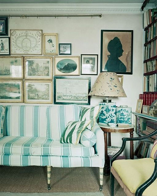
The color green is associated with nature, and with that, purity and cleanliness. It is also a “lucky” color in several cultures and therefore brings with it a sense of well-being and prosperity. It is well-suited to functional rooms like kitchens and bathrooms.

No color carries more baggage with it than pink. While we don’t adhere to strict gender norms anymore when it comes to color, pink is still strong associated with femininity. Think Barbie, Valentine’s Day…it is also a joyful and youthful color. Pink, once used solely for little girl’s rooms, regained popularity in home decor a few years ago and never left. Pink has been embraced in every room in the house.
White with its lack of obvious connotations, white is a classic fall-back- either as a way to make a room look bigger, to project a feelings of minimalism and spareness, or to act as base paint color for more impactful furnishing and decor. White can look calming, but also stressful as there is nothing to hide with white. Every flaw, every speck of dirty becomes visible quickly. Use this color with caution unless you want to spend your spare time cleaning and perfecting.

No color packs more of a punch than yellow. While not for the faint of heart, this color is full life and joy. With its sunny optimism, this color shouts “welcome!”. it would make a great color for a foyer or entrance. If this sounds to garish to you, don’t forget the array of yellows out there, from pale, buttercup yellow to deep gold.
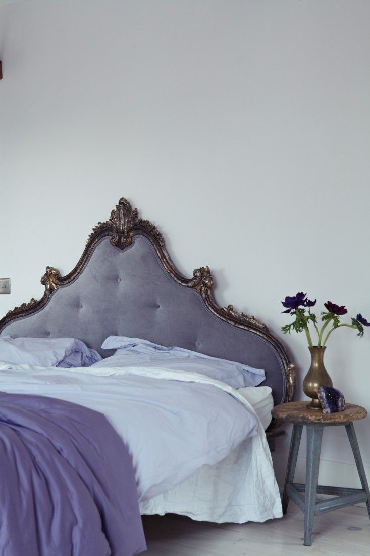
Pale purple colours like mauve and lavender have a delicate and soothing energy. Bedrooms are the place you want to evoke a sense of serenity, calm and peace. More “grown up” thank pink, pale purples evoke an elegance and refinement and sense of maturity.

Red, like yellow, is not for the faint of heart, but the impact on a space can be dazzling. The key is to choose your shade of red very carefully. Red is an energising color, full of life and vitality. In fact, its so motivating and vibrant that its used frequently in business and products to motivate a person to purchase - it is as if the color is saying, “look at me”! Because of this, some reds will make your home look more than the fast food establish Pizza Hut than an classy and stylish home.
Complimentary Colors
While monochrome decorating is definitely still a winner, most of us will want an array of shades in our space that compliment each other in a pleasing way. This is also a great way to bring is a riskier color with a piece of furniture or art in a bright accent color.
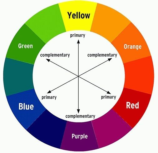
If you have no idea where to begin, start with experimenting on the color wheel - the two hues that are opposite each other on the color wheel. Then use Google Images or Pinterest to search for inspiration images using these two colours. This should give you a pretty good idea on what it would like in your space.
What’s Your Temperature?
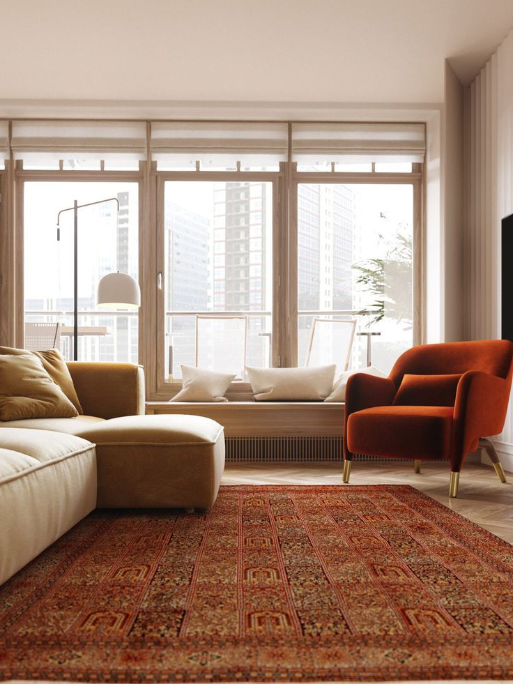
image source unknown
Colors fall into either “warm” tones or “cool” tones. Spaces look most cohesive when you stick to one of these and then choose only colours within this. Even “neutrals”, like beige and taupe, are not exactly neutral, and what you choose will have a big impact on the overall effect. Some neutrals have warm undertones and vice versa.
Using Light

image source unknown
The colours you use in your home are greatly altered by light. This means both the natural light as it changes throughout the day, as well as the artificial light you use within your home. When choosing colours, think about what kind of light your rooms will get. For example, are they north-facing? Will get they get full sunlight in the peak of the day? This will great impact the colours in your space as they interact with light changes. For artificial lighting, you can take full control of this through clever placement and light dimmers to change and alter it to suit your tastes.
Hire an Expert

Set of 4 Marseille Soap Prints. Shop Here
Decorating can be hard, and things don’t always come out looking like to inspiration pictures we save on Pinterest or Instagram. If you’re drowning in options and can’t figure it out, why not hire an interior designer to make you a color palette? You can reach out to them via sites like Fiverr or Upwork. For a reasonable fee, they’ll do all the hard work for you.
Beyond this basic intro to color theory is a world of variety. If you’re drawn to bright shades, be brave and bring these colours into your home! If you are drawn to more muted shades, make your home into a haven of calm and quiet with the soft color palette of your choice. Whatever you choose, you are sure to create a delightful space.


Comments